Brand
Resource
Guide
Download Guide

Logo Guidelines
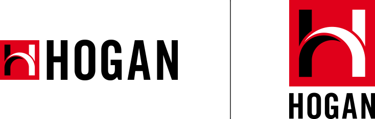
The Hogan logo is the most visible form of the organization’s brand identity and equity, and should be managed carefully to ensure the integrity of Hogan’s global brand. Hogan logos are made up of two elements: the Hogan logotype and the stylized H icon. While the icon may be used without the Hogan logotype in some instances, the logotype may never appear without the H icon.
Clear space equals the width of the uppercase “H”. No written information or other logos should appear within this space.
Vertical logo must be at least 0.5″ (1.6 cm) wide. Horizontal logo must be at least 1″ (2.5 cm) wide.
On black backgrounds, the logotype for the two-color logo should be reversed to white.
A 100% black logo may be used on backgrounds with a value of no more than 30% black.
A 100% white logo may
be used on backgrounds with a value that exceeds 30% black.
Do not alter the logo
colors. Only those noted above are acceptable.
Do not dimensionalize or add highlights and shadows to the logo.
Do not distort the proportions of the logo.
Do not modify the logo or
replace the logotype with
an alternate typeface.
Do not substitute another name for Hogan.
Do not place the two-color logo on colored backgrounds or patterns.
Do not use the logo as part of any sentence or slogan
Do not alter or rearrange
logo elements.
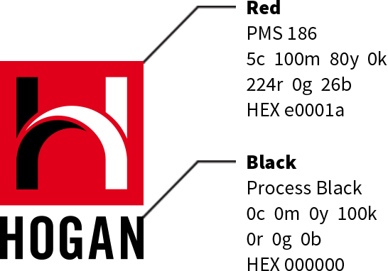
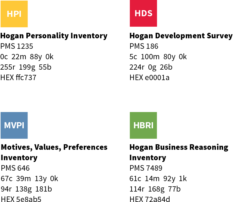
Brand Colors
Typography
Primary
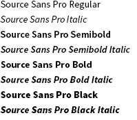
Source Sans Pro Source Sans Pro is the primary Hogan font for printed text. Simple and versatile in a number of languages, use Source Sans Pro for documents and reports that will be translated into other languages.