


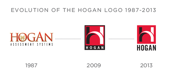
 When I joined Hogan as creative manager in 2008, one of the first major projects I undertook was redesigning the logo. The existing logo had gone through a couple of iterations since 1987, and at that point was too visually complicated and not very versatile. Also, the logo at that time used the full Hogan Assessment Systems name, while it had become clear that a large part of our client and distributor base was referring to us simply as The Hogan or Hogan, both in noun and verb form.
With these factors in mind, my goal was to develop a bold and recognizable new brand identity that worked well across a number of applications. The prospect of distilling Hogan's business focus into a few simple shapes was not a simple one, and a good logo should maintain visual integrity whether reproduced digitally or in print, in color or black and white, whether large or small. For the sake of maximum flexibility, I also wanted an icon that was instantly recognizable independently of the Hogan name.
From my initial conversations with Robert Hogan, I knew that part of what needed to be conveyed was a sense of strength and boldness, an extension of the idea that Hogan is nothing short of a commanding presence in the personality assessment arena. The other element I wanted to incorporate was the idea of a bright side and a dark side, which is the unique and fundamental basis of our core assessments. Out of those ideas came the current logo's stylized H in black and white, on top of a bold red field.
From then to now.
#throwbackthursday #tbt